Spending five days with the game is enough to know it's not to my liking. Is it a horrible MMO? Yes, yes it is. There are better Free to Play MMOs launched years ago that are better than this. As a fan of the Final Fantasy series (I am currently playing and liking Final Fantasy 13), this MMO is so bad that at some point I couldn't justify the awful environment, game play, and interface.
Imagine that FF14 is an MMO stuck with a mentality that is 10 years in the past. It is archaic and obtuse. For a large scale subscription MMO I expected better. Some gripes over the last few days of play:
- The account system where you create your character has some of the worst menus and an overall lack of clarity and simplicity. Usually MMO website account sections are easy to manage, but the Square-Enix site is not user friendly at all.
- Character customization is overly simplistic, limiting the player to basic choices like four eyebrows and a few haircuts. Recent MMOs like Aion have raised the bar considerably in character creation, allowing you to tweak dozens of minute features to your character. Free to Play MMOs like Vindictus also offer better customization.
- Lack of proper instruction for game play. The game starts you with a small introductory fight. It tells you to go into active mode to fight, but never tells you what key to press to enable that. It also doesn't tell you many things specifically and you're left in a game of trial and error to finish the fight. Just any other MMO has a better introductory tutorial sequence than this: Age of Conan, Aion, LoTRO. Rappelz, a Free to Play game, has a small island wholly devoted to teaching a new player how to play (Fight, Buy, Equip, Skills, Mount).
- Vagueness. When you need help they don't let you know in detail. If you're a veteran player of FF11 you might not have a problem, but for new players the game is a mystery. What is a Retainer? The explanation doesn't say if it's free to have an assistant or if it will cost me. How do I summon one? With a bell, but they never showed me what that bell looks like or where it might be located in the city. You would think they would show a first timer that much. What is a Pearl the first NPC gave me? No proper explanation. How come vendor NPCs are not labeled as so? If i want to find the weapons seller, how do I find him unless I talk to every single NPC in the city?
- Lack of direction. It took me an hour to find the way out of the initial city. Some exits were dead ends unless you had the proper clearance and the city is so big that it was easy for a new player to get lost in.
- Too many clicks to do anything. Want to do something? You probably have to do 10 things before you actually accomplish it. To attack something: Be within range, go into active mode, select target, select skill, select target again to confirm, attack the target. Inventory, accessing the crystal nodes (that activate a quest), and options menu use too many clicks to get where you want to go.
- Death. This one is a prime example of an unfriendly interface. The first time I died I didn't know how to re-spawn. On any other game, when you die, there is a screen that asks you what to do. This is a easy and fast way to chose to remain dead and wait for a resurrection or return to town. In this game when you die nothing happens, you stay dead. Pressing ESC, Enter, or any other key doesn't bring any menu that would help you get out of this. For the proper way to return to town I had to go to a fansite and actually read on how die properly. What the hell. When a new person needs to go to a website to learn how to do something so basic then there is something wrong.
- Menu lag. If you can believe it, there is menu lag. It feels like your input is just a bit late in registering your choice and it feels like you're floating with your cursor. Lowering the graphics settings doesn't help either. It's just really weird that your commands don't register right away.

- Action lag and terrible game play. Because of the input menu lag, the fight feels like they are in slow motion. And like mentioned above, too many clicks to simply attack any monster.
- TP is a terrible idea. TP is like a stamina bar that lets you execute a certain amount of attacks within a time period. This is in addition to individual skills cool down periods. So for example, to cast ice you have to make sure you have enough TP built up and that if you have cast ice before, that four seconds have also gone by. Every other MMO out there only has a cool down timer and not a TP mechanism because it doesn't make sense to have a double requirement to use a skill.
- Graphics performance. I have an ATI 5850 and it just isn't up to par. Other games like Vindictus and Aion look and run better. Even LoTRO has better looking environments than this new MMO.
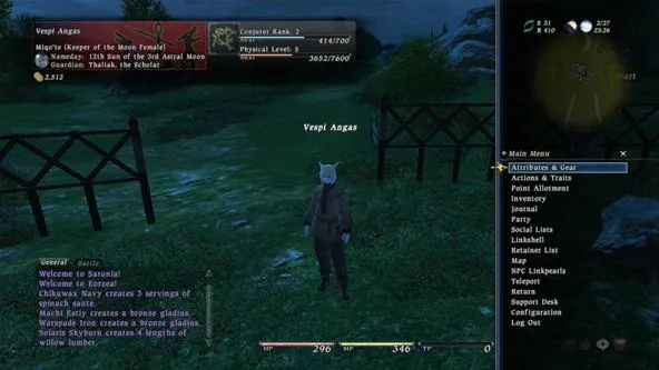
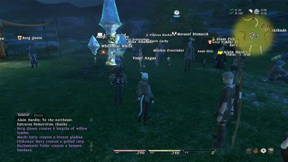
- I swear, every time I logged into the game it was pitch dark night time. That was probably just my bad luck:

- Not sure what else to do other than craft and do quests. No end game, pets, houses, auction house. Reading the websites and other places don't give a very clear direction as to where the game might go.
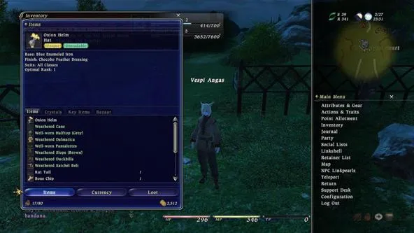
- Inventory layout. It's shown as a list rather than thumbnail and it makes for very awkward browsing:

If you're looking for a subscription game MMO: Aion, Age of Conan, or WoW are better.
For a Pay to Play MMO that is better than FF14: Rappelz, Lord of The Rings Online, Vindictus.
There are some good things about this game. Using the controller was great and the way quests let you teleport back to the starting location was a good feature too. That's about it, there was nothing else in the game worth complimenting.


Comments
Be the first, drop a comment!